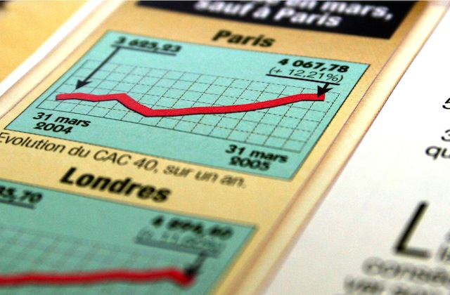
Graphs are great for illustrating a story, and also excellent at misleading people.
A good example of where a graph can give an incorrect impression is the Sydney Morning Herald’s story Whatever Happened to the Middle Class.
The story is a very good explanation of the predicament Australia’s political classes have put themselves into – exacerbated by their 1950s view of dividing the workforce into poorly paid ‘blue collar’ workers and affluent ‘white collar’ office staff – but it suffers from the selective use of headline graphs.
Viewing the big picture
The first graph shows how Australians are identifying themselves as middle class and the trend looks staggering,

Now if we add those who identify themselves as working class, the picture looks even more dramatic with some pretty volatile swings,

However if we now add in those who identify themselves as rich, or upper class, we get a better perspective as the entire range is now shown,

Selective choosing the Y, or vertical, axis will always give an exaggerated view of a trend or proportion. Once we take the full range in we see the real extent of things. It also has the benefit of showing the trends aren’t as volatile as first appear.
Middle class perceptions
When we look at the graph showing the full picture there’s a number of interesting trends and characteristics about Australian society that come out of it which are worthy of some future blog posts.
Most notably is the identification of Australians being middle class as their property values increased.
On this point, it’s worthwhile contrasting the Australian experience with the US, here’s a Gallup poll from last year on how Americans see themselves,
While the definitions are different – that Americans differentiate ‘working class’ and ‘lower class’ is interesting in itself – it’s clear that the same trend happened in the US with more people identifying themselves as being members of middle class when their property values were increasing.
In 2008 and 9 there’s suddenly a sharp increase in Americans identifying themselves as working class as the property downturn bites. The steady increase in those claiming to be ‘lower class’ from 2006 onwards is worth closer examination.
What this means for Australia
The implications of the US trends is that any Australian politician intending to dismantle John Howard’s middle class welfare state will have to wait until the property market falls before trying to win any popular support.
For this year’s Australian election though, what’s clear is that any attempt to stoke the fires of class warfare is going to fail dismally in the outer suburban marginal seats so coveted by both parties.
We’re going to see a lot more selective graphs during the course of this year, it’s worthwhile taking time to look at them closely. The stories may be different, and a lot more nuanced, than the headlines tell us.


